Brand consistency is one of the most underrated drivers of business growth. Studies show that consistent brand presentation across all platforms increases revenue by up to 23%. In a marketplace flooded with competition, the brands that customers recognize instantly, trust intuitively, and return to repeatedly are those with unwavering visual consistency. This guide shows you how to build that consistency with the right tools.
What Brand Consistency Actually Means
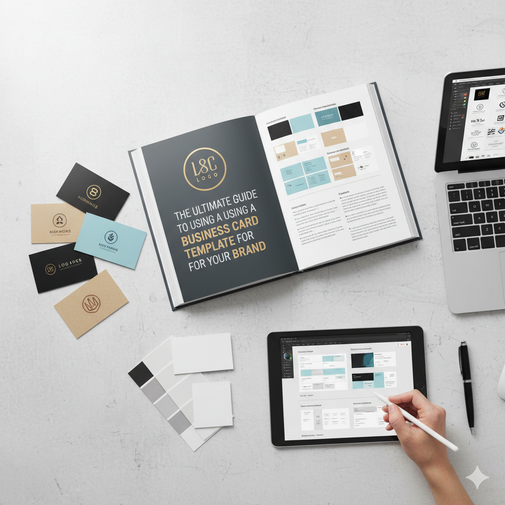
Brand consistency means that every touchpoint your customer encounters — your website, your social media, your packaging, your email newsletters, your presentations, your business cards — uses the same colors, fonts, design style, and tone of voice. It means that when a customer encounters your brand anywhere, they immediately recognize it as yours, without needing to see your logo. This level of recognition is the foundation of brand equity and customer trust.
The 4 Pillars of Visual Brand Consistency
Typography: Choose a primary and secondary font from the Vault Font Collection and use them exclusively across all brand materials. Color Palette: A primary color, secondary color, and 1-2 accent colors used consistently in all design materials. Design Style: A consistent approach to photography, illustration, pattern, and overall visual aesthetic. Layout Principles: Consistent spacing, hierarchy, and compositional approaches across all materials.
Build Consistency Across All Your Brand Touchpoints
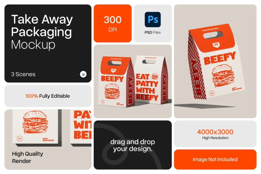
Apply your brand system consistently to your Shopify store theme, your social media templates, your product mockups, and your presentation decks. Every element should feel like it belongs to the same family — because it does.